Showing posts with label geek out. Show all posts

Sunday, January 03, 2021

Enabling SSL on Blogger with You Are Not Authorized Error

Everyone knows that SSL encryption has been required of all browsers since 2017. If you don't have it nowadays, you get the dreaded Not Secure warning next to the URL. 

But what if you have a blog hosted on Blogger with a custom domain name? Back then, it was costly to purchase SSL and even trickier to implement (which I've done for my work company). In 2019, Google started to provide free SSL for Blogger blogs. When I got around to implementing it, I got the dreaded "You are not authorized to use this domain" error. Clearly the custom domain name works and I own it, why the error?

After much searching, I found that I set up this blog custom domain many eons ago (10+ years) and Google as since changed the DNS configuration for Blogger custom domains. The only way I got this to work was to first remove the custom domain from Blogger and then reimplement it with the new CNAME. So from the beginning...

  1. Log into your domain provider. I use GoDaddy, so screen shots will be shown from there.
  2. Go to your Blogger menu and click Settings on the left.
  3. Scroll down to Publishing and click on Custom Domain.
  4. Click Delete (I know this is scary, it's just temporary...)

  5. Now add the domain name back to the custom domain. This time, you will see an error with some small print saying how to set up the DNS configuration with your domain provider. Copy the CNAME information down in Notepad. This info is unique to your blog.
  6. Go back to your domain provider and navigate to the DNS settings for your website. In GoDaddy, it's Manage DNS under the 3 dots.

  7. If you already have the custom domain, you should already have the CNAME entry for www to ghs.google.com. Click Add at the bottom and add the CNAME with all the cryptic characters. It should look something like this when you're done.

  8. Go back to Blogger and add the Custom Domain name again. It should work this time.
  9. Now scroll down to HTTP section and enable HTTPS availability.

  10. The status will change to Available shortly. Try to access your site with the https:// prefix. It will take 15 minutes to an hour to become effective. Be patient!
  11. After you can access your site over https://, then you can enable the HTTP redirect.
  12. Enjoy your free SSL!

Friday, November 15, 2019

Half Page Turns for Digital Sheet Music

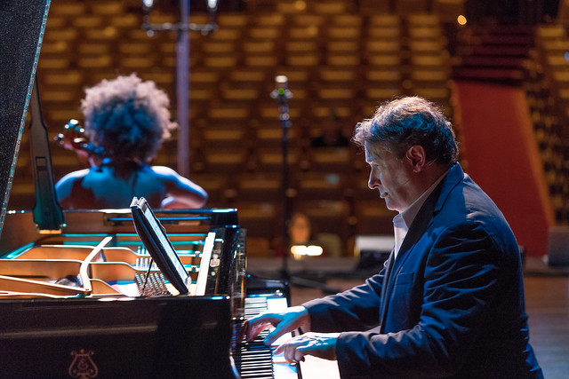
Performing with one of my favorite page turners, Adam.


In 2012, we watched Christopher O'Riley perform on From the Top with a laptop folded back on the piano. This was before tablets were widely used, and certainly before the full-size iPad Pro came out.

Christopher O'Riley with Gordon Neidinger, mandolin, From the Top 2012


Host Christopher O'Riley with Ifetayo Ali-Landing
From the Top Photo by Neale Eckstein, 2017
Shortly afterward, Mr. O'Reilly switched to an iPad as seen here with Ifetayo Ali-Landing in 2017. Being a software geek through and through, I had to jump on the bandwagon. I didn't want to invest in an iPad Pro in case my efforts fell flat. I opted for a used (unfortunately discontinued) Samsung Galaxy Pro Tablet 12.2" and a Donner Bluetooth Pedal. At around $350 total, this is a much smaller investment than an iPad Pro 13" at $1000 and top off the line Page Flip Firefly Bluetooth Page Turner Pedal at $110.


Cheapness does come with a price. I lost 0.8" on the diagonal screen dimension (12.2" vs 13"), but because of the aspect ratio, this becomes even more in the horizontal direction in portrait mode. The width of the page determines how large the sheet music appears on the screen. Full-size sheet music is 9"x12" which is the same 4:3 aspect ratio as the iPad, or 1.333. Even 8.5"x11" pages have a similar 1.29 ratio. By comparison, a 16:9 ratio is 1.778. Here's a little math to determine the difference in the width of the two screens.


So the width of my 16:9 12.2" tablet screen is 6" versus the iPad at 7.8". That's a huge difference in width! So how does 6" look against the same music on a 9x12" page?


Actually, not that bad since music apps crop the white space of the page. At first, I was bothered by the bluish hue of the white background but I finally found the sepia tone to be more like sheet music paper.

The first thing I realized about using digital sheet music is that you have to turn the pages twice as often as paper sheet music. Paper sheet music in books or binders always show two pages at a time. This is fine when the music is not very complex, but when you in a complicated passage near the page turn this can be quite stressful. If you stomp the pedal too many times or press both pedals at once, the on-screen keyboard may pop up by accident or worse the program crashes. This would be disastrous in a performance!


My initial app for sheet music was Orpheus, but then I moved to MobileSheets for this feature: half page turns! I watched a fellow chamber music pianists effortless play a piano trio with his iPad Pro and asked him how he became comfortable turning pages with the pedal. He showed me his nifty forScore app (iOS only at a pricey $14.99!!) and how he uses half-page turns. Wait - doesn't that mean you have to turn pages twice as often, or 4 times the number paper sheet music turns?

With half-page turns, you press the pedal somewhere in the bottom half of the page and half of the next page pops on top of the screen. Then you seamlessly play from the bottom of the screen to the top of the screen without having to worry about pressing the pedal at exactly the right time. After you get to the next page at the top of the screen, you press the pedal again when it's convenient to fill down the rest of the page. So page turns are essentially decoupled from the actual playing and don't have to be timed perfectly right. Even though it's more presses, it's far less stressful.

But I didn't have an iPad Pro with the forScore app! With some searching, I found that the free version of MobileSheets also had half-page turns. It's a little tricky to enable, so here are the instructions (note the sepia tone which is easier on the eyes):

Tap and hold the screen to get the bottom toolbar.


Tap the page button (4th icon circled in green).


Under Display mode, select "Half Page". Also, you can set the Sepia tone lower on this settings page. Another setting I found invaluable was the page scaling mode (next button on the bottom toolbar). When you set to full screen, it stretches the page so that you don't get the letterbox wasted space you can see with the Orpheus screenshots at the beginning of this post.


Here is a half-page turn for a tricky passage in Beethoven's Archduke trio. You simply play from the bottom to the top of the page. In fact, this is a better way to learn the music through a paper page turn because you can see it all at once.


My first performance with digital sheet music was with Claude Bolling's Suite for Flute and Jazz Piano. My sheet music copy was purchased back in 1980 and is completely falling apart. Every time I practiced, more pages would opt to leave the binding and the scotch tape everywhere was getting ridiculous. The performance was definitely a bit more stressful with the digital page-turning, but it wasn't disastrous.

Still, I feel more comfortable with paper sheet music for performances. I mostly use digital sheet music to try out pieces before I decide to print them. Maybe someday I'll become more comfortable with it, but in the end, I'm still an old-fashioned paper sheet music gal. Thank goodness I didn't plunk down the money for the iPad Pro (although I'm sure I could find other uses for one)!

Tuesday, April 25, 2017

Fitbit Charge HR Reports Higher Heart Rates by a 4:3 Ratio

Ever since I got the Fitbit Charge HR with continuous heart rate monitoring, I noticed that it sometimes reported much higher than expected heart rates while exercising. I would often get peak heart rates of around 185 bpm (beats per minute) which is actually impossible, according to the 220 minus your age rule. According to that rule, my maximum possible heart rate is only 170 (yes, I'm that old now!). At first I thought it was simply reporting one and a half times the actual heart rate, but with some experimentation and analysis, I found it was a more subtle ratio.


Here are two identical walks that I took at lunch taken 10 days apart. They have the exact same route (maximizing Pokestops), and a bunch of hills. The hills account for 21 flights of stairs, or approximately 210 feet climb in altitude, including these sets of stairs here.  There are only 3 of 5 flights shown in this photo!


The pace was a little slower in the second walk, but somehow that finally got the Fitbit to measure the correct heart rate! This was the only time (out of close to a hundred walks) that I didn't get a ridiculously high heart rate recorded.

Here are the two heart rate plots recorded for these walks. The peak heart rate the Fitbit records is 183 bpm in the first plot. In the second plot, it's only 136 bpm, with no time in the peak heart rate zone, which I believe is accurate. I try to check my Fitbit during the walks and when it's not measuring correctly, there's usually two dashes in the heart rate display. I've gotten measurements at the top of these stairs and it is usually somewhere between 134 and 140 bpm. Surely a good cardio workout, but not pushing the physical human limits at 183 bpm! The steps are close to the middle of the walk, so it coincides with the peak heart rate of the second plot.


If you simply divide 183 by 136, you get a 1.346 ratio. It's not a simple 1.5 ratio. Maybe the Fitbit takes into account the maximum human limits. It knows my birthday, yet it can't keep the peak heart rate below 170 bpm. I decided to plot 183 and 136 bpm to see how the beats fell against one another. I did find a correlation between the 3rd beat of the lower heart rate and the 4th beat of the higher heart rate, which is a 1.333 ratio. I adjusted the lower number to 139 bpm (within the range that I measured during the walks) to further show this correlation.


It could be that the Fitbit doesn't measure heart rate as many times a second as you expect, or the algorithm is just off. It clearly states that it cannot be used as a medical monitoring device, and that's evident from my use of it. If and when I get a new Fitbit (all of ours are falling apart after 1.5 years), I'll be interested to see if there are improvements to the heart rate monitoring.

Thursday, June 30, 2016

How to Get OneNote to Look Like Evernote

Like many others, the news that Evernote is limiting the free Basic accounts to two devices completely infuriated me. Since I have Evernote installed on two computers as well as my iPhone and iPad, this change will render the application completely useless in 30 days. The web Evernote interface does not provide the flexibility of showing lists of tags along with their notes. I don't have a need for huge amounts of storage, and the lowest price tag of $34.99/year is way too much for what I use it for. But my 347 carefully organized notes needed a new home. After searching a bit, I found that Microsoft OneNote conveniently has an import tool for Evernote. However, making the OneNote user interface act and feel like Evernote took some tweaking. Please note that only the Office version of OneNote can be modified to look like Evernote. The OneNote application from the Windows 10 Store, like many Windows 10 apps and features, is too dumbed-down to customize. These screen shots are for Microsoft OneNote 2013, but many features are available for earlier and later versions.

This is how I currently view Evernote:


Notebook and Tags on the left, the list of Notes for that Tag in the next column, and then the selected Note on the right. Makes perfect sense for the obsessively organized.

First, download and run the Evernote to OneNote import tool. When I first opened OneNote after importing, I was appalled by the user interface. All my previous Tags became way too many Section tabs across the top of the page (looks even worse full screen).


To show the Sections (was Tags) on the left side, first Pin the Notebooks by clicking the down arrow next the notebook name, and clicking the push pin.


This shows you the notebook list but not the Sections. Click on the down arrow for the notebook to expand the Sections.


Starting to look better! To move the list of Pages to the left, click the File menu and then Options.


In the Display section, click "Page tabs appear on the left", and click OK.


Now this is more usable! There's no way to remove the annoying tabs on top, but having them vertically on the left side is where I focus.


There have been a few things about OneNote that I like better than Evernote. Since Sections are more like folders instead of tags, you can nest sections under each other (notice the Work section). Also on my iOS devices there is Offline access, which I would have had to pay for in Evernote. I'm rarely disconnected from the internet, but it makes it faster and doesn't require using cellular data when I need it. Goodbye Evernote!

P.S. Don't get any ideas about having the VIN number for the BMW 325xiT, that car is long gone!

Monday, January 20, 2014

Google Auto Awesome Gallery

Here's some Auto Awesome Google applied to my Auto Backup photos.  Some are super cool, and some just a bit strange...  You can find your own magic photos in your Google+ photos by selecting Auto Awesome under Type from the Search pulldown menu or by typing #AutoAwesome in the search box.

Mix: If you've taken a series of portraits sharing similar background elements, Auto Awesome will compile these photos together into a photobooth style grid. Mix is meant to showcase portrait photos taken with similar backgrounds in time, so it works best with close-ups of faces.
Auto Awesome Mix

I barely remember when Adam was so small!

Motion:  If you've taken a series of photos in succession (at least 5), Auto Awesome will stitch these photos together into a short animation.
Auto Awesome Motion

The majority of the my Auto Awesome is Motion since my camera trigger finger is always snapping away. Vote for this photo for BlogHer '14 Photos of the Year (you must be logged into BlogHer to vote).

Smile: If you've taken a few group photos, Auto Awesome will choose the best shots of each person in your image and merge them into one great looking photo.
Auto Awesome Smile
I found a new smile on my mom for this one.

Action: Take a series of photos of someone moving (dancing, running, jumping) and Auto Awesome will merge them together into one action shot where you can see the full range of movements in a single image, capturing the movement in one captivating still.
Auto Awesome Action


OK, Adam with three legs is just not cool!

Pano: If you've taken a series of photos with overlapping landscape views, Auto Awesome will stitch these photos together into a panoramic image.
Auto Awesome Pano

Apparently Pano works to clone people as well!

Snow:
Auto Awesome Snow


The snow is magical on this photo of Norman Rockwell's Main Street (Stockbridge Main Street at Christmas).

Twinkle:
Auto Awesome Twinkle


Auto Awesome Twinkle

No where will you find more lights at Christmas time than at Walt Disney World!  Including The Great Christmas Light Fight.  The added twinkles are really like being there!

Thursday, June 06, 2013

Microsoft Office on iOS - On CloudOn Nine

I've been happily using Dropbox for three and a half years but the one disconnect has always been the ability to edit my Microsoft Office files on my iPhone or iPad. I was leery of plunking down cold hard cash for QuickOffice Pro, especially since I would need a different version for the iPhone ($15) and the iPad ($20).

Earlier this year, I discovered CloudOn, a FREE app for editing Microsoft Office documents. Originally, it was only available on the iPad, but recently they've offered an iPhone version. The first thing that enamored me was the effortless, instant link to Dropbox. As you can see, you can use a variety of cloud drives, but gladly, my favorite was there.


Tuesday, March 15, 2011

I Can Be… Computer Engineer Barbie


Barbie® I Can Be...™ Computer Engineer* Doll

Last year, Mattel announced that Barbie’s 126th career was voted to be Computer Engineer.  When I heard this, I immediately thought, wait, that is me!  Although I am technically a mechanical engineer turned software engineer.  What exactly is a computer engineer anyway?  Not an electrical engineer or computer scientist or software engineer or software developer.  Apparently, I am of that generation, where a degree in computer engineering in and of itself was relative rare (and still non-existent at MIT).
According to Wikipedia:
Computer engineering, also called computer systems engineering, is a discipline that integrates several fields of electrical engineering and computer science required to develop computer systems. Computer engineers usually have training in electronic engineering, software design, and hardware-software integration instead of only software engineering or electronic engineering. Computer engineers are involved in many hardware and software aspects of computing, from the design of individual microprocessors, personal computers, and supercomputers, to circuit design. This field of engineering not only focuses on how computer systems themselves work, but also how they integrate into the larger picture.
OK this is definitely not what I do (no circuit design or firmware for me). But to the layman, computer engineer still fits.  For about six months, I had the PDF announcement of the new career tacked up at work before I finally purchased it for myself last month (apparently the hints to family and co-workers didn’t work for the holidays).

I Can Be... Computer Engineer Barbie

According to the announcement,
To ensure the doll accurately reflects this occupation, Barbie®  designers worked with the Society of Women Engineers and the National Academy of Engineering to ensure that accessories, clothing and packaging were realistic and representative of a real computer engineer. Looking geek chic, Computer Engineer Barbie® wears a t-shirt featuring binary code and computer/keyboard icon along with a pair of black knit skinny pants. Computer Engineer carries a Barbie® smart phone, fashionable laptop case, flat watch and Bluetooth earpiece. With stylish pink-frame glasses and a shiny laptop, she is ready to conquer the day’s tasks on the go or from her desk.
On the Mattel shop page, there is a video of the doll designers.  That could be me as a doll designer!  Oh wait, I’m the computer engineer.


Barbie has an iPhone of course, and I love Barbie’s outfit, especially the circuit board design on the sleeves and the “black knit skinny pants”.  Unfortunately, such pants would violate this computer engineer’s company dress code (my Rock is Dead t-shirt was worn on casual Friday).  The box itself is filled with cool geeky graphics like the Linux penguin and iPad? next to it.  But the coolest thing is on the monitor.

P1040834

Do you see the seemingly non-sensical binary bits of 0’s and 1’s in pink on the monitor?
01000010
01100001
01110010
01100010
01101001
01100101

If you convert the binary to text (ASCII) characters, you get: “B-a-r-b-i-e”, Barbie!!!  How cool is that???  I can’t believe that Mattel actually went through the trouble of spelling Barbie in binary.  How many people did they think would notice?  It is most likely the code on her shirt as well (I can’t tell because she’s never coming out of the box).

Dova was jealous that I got myself a new Barbie and I said, why not?  She replied, “But you’re 44!”  Yes, a 44-year-old who will keep her prized Barbie hermetically sealed in her super cool box.

Sunday, February 28, 2010

Makeup vs. Thumb Drives


One of the many swag items that I brought home from BlogHer last year is this cute Mary Kay makeup case. But what's that white band around it? A Michelin flash drive?


On the inside, the case is full of the thumb drives that I got from BlogHer. But wait, there's a lip gloss in there after all. And a couple of Positivity bracelets.  I did a round-up of flash drive sizes (if size matters):
  • Ford:  1GB
  • Ann Taylor:  256MB
  • Elations:  256MB
  • Dove:  128MB
  • Michelin: ??  I ended up recycling it because it was a pain to open.
Since then I've added more drives that I've acquired.
It is the perfect case for thumb drives!  Forget makeup, this geek prefers flash drives. Nerd

Friday, November 20, 2009

Dropbox Fever!

Last year, I posted about the great tool, Syncplicity. It allowed me to sync files on multiple computers as well as store them in the cloud. Since it came out of beta however, they changed the terms of the free account to only allow synchronization between two computers.  As a bonafide geek, I regularly use three computers, so I had to change my workflow a bit to only use two computers regularly (i.e. take my work laptop on personal trips instead of my home laptop).


Then I heard about Dropbox.  The free account has the same storage capacity as Syncplicity (2GB), but it does not have the two computer restriction.  In fact it also has an iPhone application, so you can view your files on your iPhone!  When I heard that, I was all over it.

There are a few gotchas that I had to overcome with Dropbox.  With Syncplicity, you can choose any folders to synchronize.  Dropbox requires that everything be in a specified Dropbox folder.  That presented a problem with Windows Live Writer.  I use Live Writer to hold most of my blog drafts so that I can work on them offline, especially while travelling.  But Microsoft only allows you to save drafts in its own “My Weblog Posts” folder under “My Documents”.  I abhor “My Documents” and anything that has the word ‘My’ in it (although I use it on occasion in programming, maybe the Microsoft way has rubbed off on me).  So the default location for my blog drafts could not be synced with Dropbox.

After some Googling, I found a workaround for the Windows Live Writer problem.  Thanks to Scott Is a Fool (author of the helpful Insert Amazon Link Windows Live Writer plug-in), he outlines how to redirect the “My Weblog Posts” folder to another location in both Windows Vista and Windows XP.  I followed the directions exactly on both operating systems, and redirected “My Weblog Posts” to a folder under my Dropbox folder.

Dropbox has been working flawlessly for me.  I have not had any issues with syncing or server outtages (unlike Syncplicity).  If you’d like to try Dropbox, use this referral link or click on the present below.  You will get an extra 256 MB of storage and also increase my storage by 256 MB.  Thanks!smile_shades